ImageCompare
Reveal two versions with a divider that follows your hand.
Live — this one is real
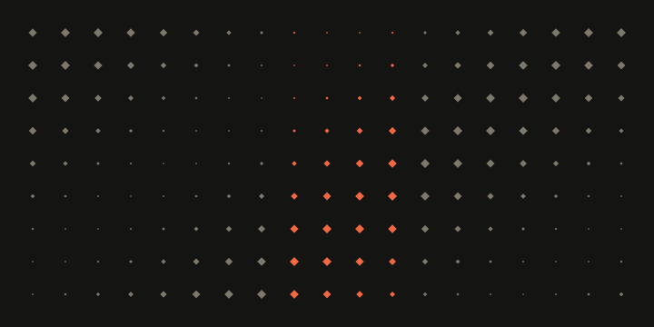
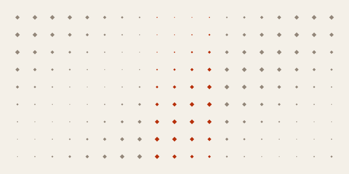
InkPaper
Usage
import { useState } from "react";
import { ImageCompare } from "mizu-ui";

export function Example() {
  const [value, setValue] = useState(50);
  return (
    <ImageCompare
      label="Surface study"
      before={{
        src: "/images/field.svg",
        alt: "Ink surface with muted diamonds",
      }}
      after={{
        src: "/images/field-light.svg",
        alt: "Paper surface with warm diamonds",
      }}
      value={value}
      onValueChange={setValue}
      beforeLabel="Ink"
      afterLabel="Paper"
    />
  );
}
Source & setup
Import mizu-ui/styles.css once. Fonts are optional via mizu-ui/fonts.css. Override --mizu-* tokens or use className for local styling. Uses native React and CSS; install the package peers for root imports.
Inspect interaction/ImageCompare.tsx
Source is included in the npm package under src/interaction/ImageCompare.tsx.
Props
| Prop | Type | Default | Description |
|---|---|---|---|
| before / after | {src: string; alt: string} | — | Images with matching composition and dimensions. |
| value / onValueChange | number / function | — | Controlled reveal percentage, 0–100. |
| label / beforeLabel / afterLabel | string | — | Figure and version names. |
Accessibility
Pointer capture enables direct dragging; a labelled native range gives keyboard and touch control. Both images retain descriptions. Load failure disables the reveal with an explained state.
Motion
Direct clipping with no decorative loop.